CAI Website Redesign
We redesigned the Culinary Arts Institute page for Utah Valley University to address declining student enrollment. Through an extensive design process—including research, moodboards, interviews, surveys, wireframes, and prototypes—we updated and organized their information to better attract prospective students. Our designs catered to both mobile and desktop audiences.
Heuristic Mark-up
To start off the project, we made a heuristic mark-up to help us identify all of the issues with the current website. We also did this to all of the subpages because we were planning on incorporating some of their information on the main page.
Mood board and Research
We did a lot of research about the different culinary schools, institutes, courses, and their website to see what our client was up against. This helped us understand different ways to present information, and what designs were attracting prospective students.
Personas and Survey
I interviewed students that were attending UVU. We send a survey out to all of the prospective and currently attending culinary arts students and created personas for the type of people that would be using this website. From the interview notes and survey results we received, we created proto personas that accurately showcased who our target audience was.
Style Guide and Assets
Our style guide was given to us by UVU. They wanted the site to work and look in harmony with the rest of UVU’s website. To get more
Sketches and Outline
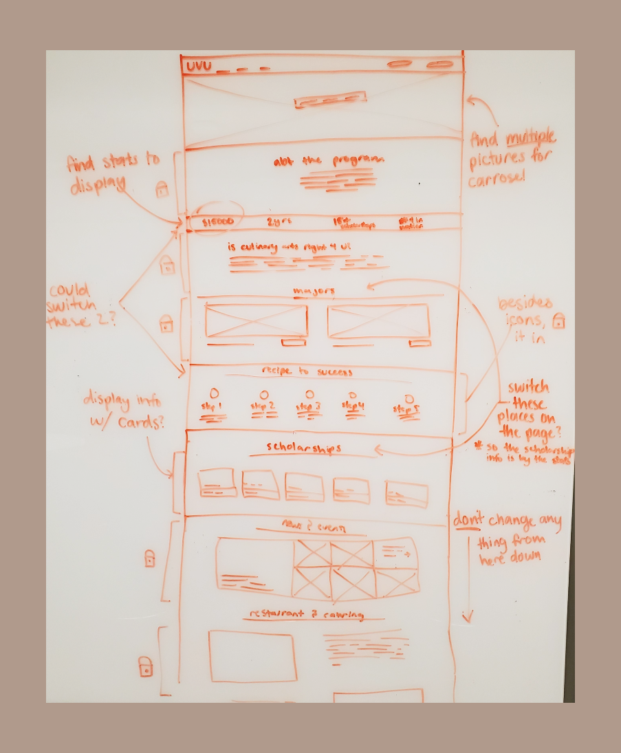
We made multiple sketches of the website and ideas that we had gathered from different sites. Sketching them out helped us see the overall harmony at an early stage to make adjustments.
Wireframes
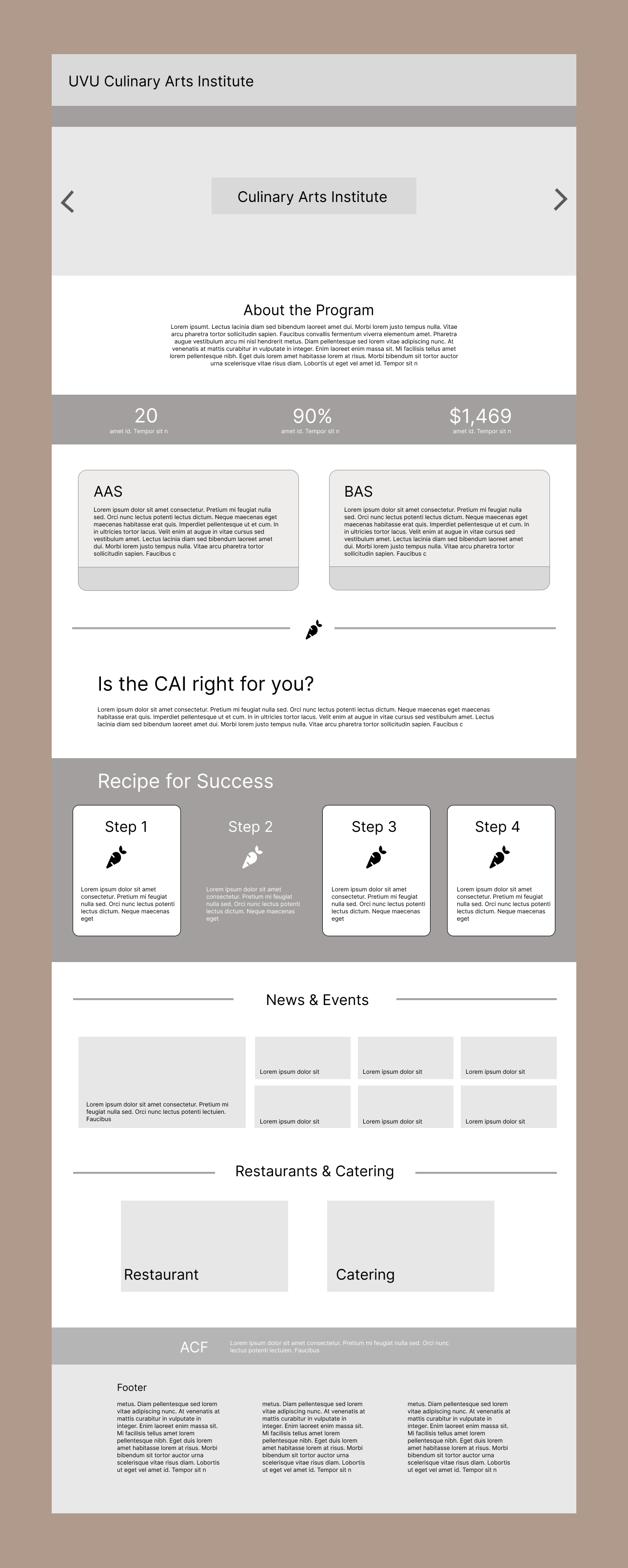
We made multiple wireframe drafts before we decided on our final one to continue building out. We consulted our client on which ideas she liked or wanted us to disregard.
First Draft:
Second Draft:
Third Draft:
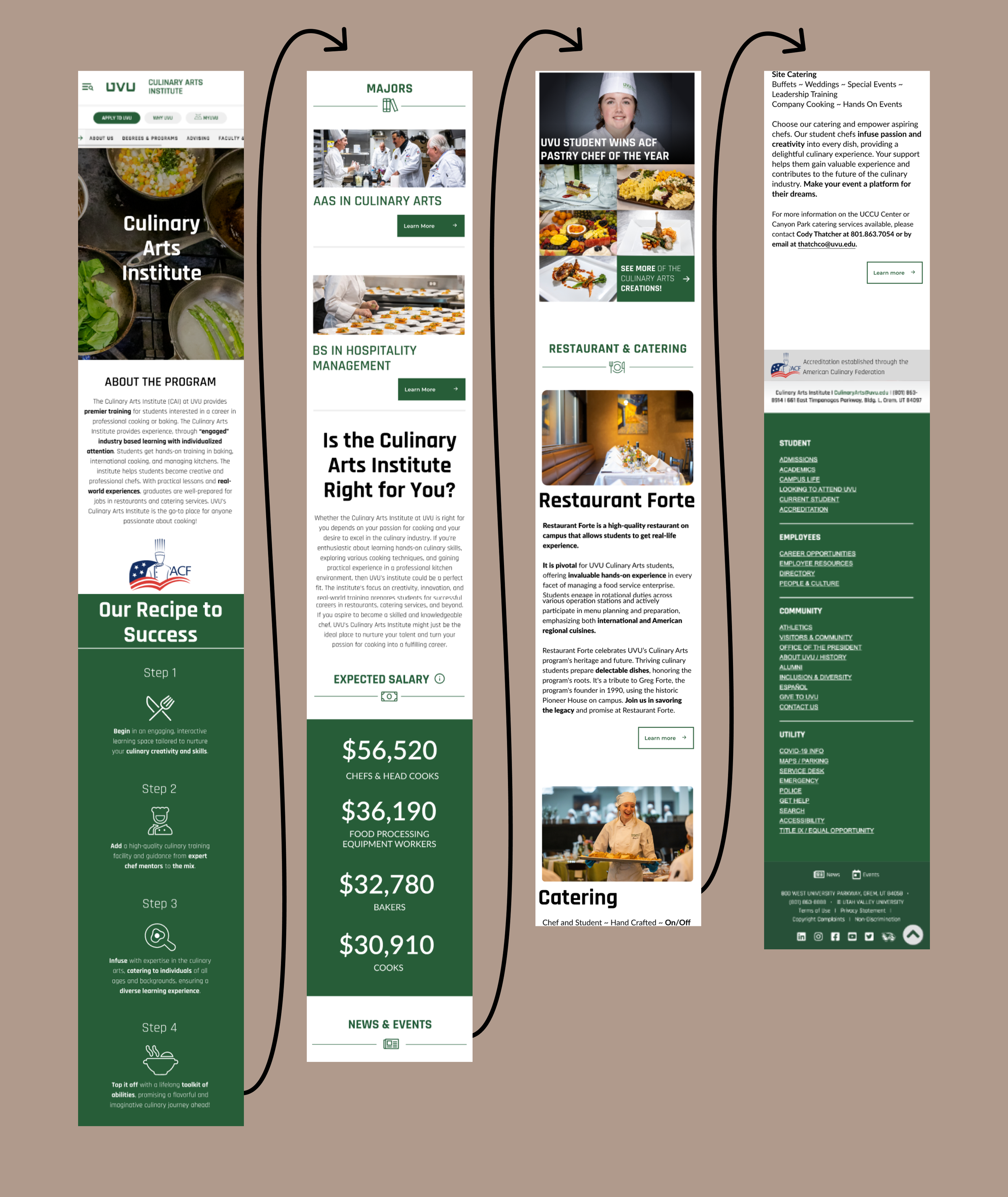
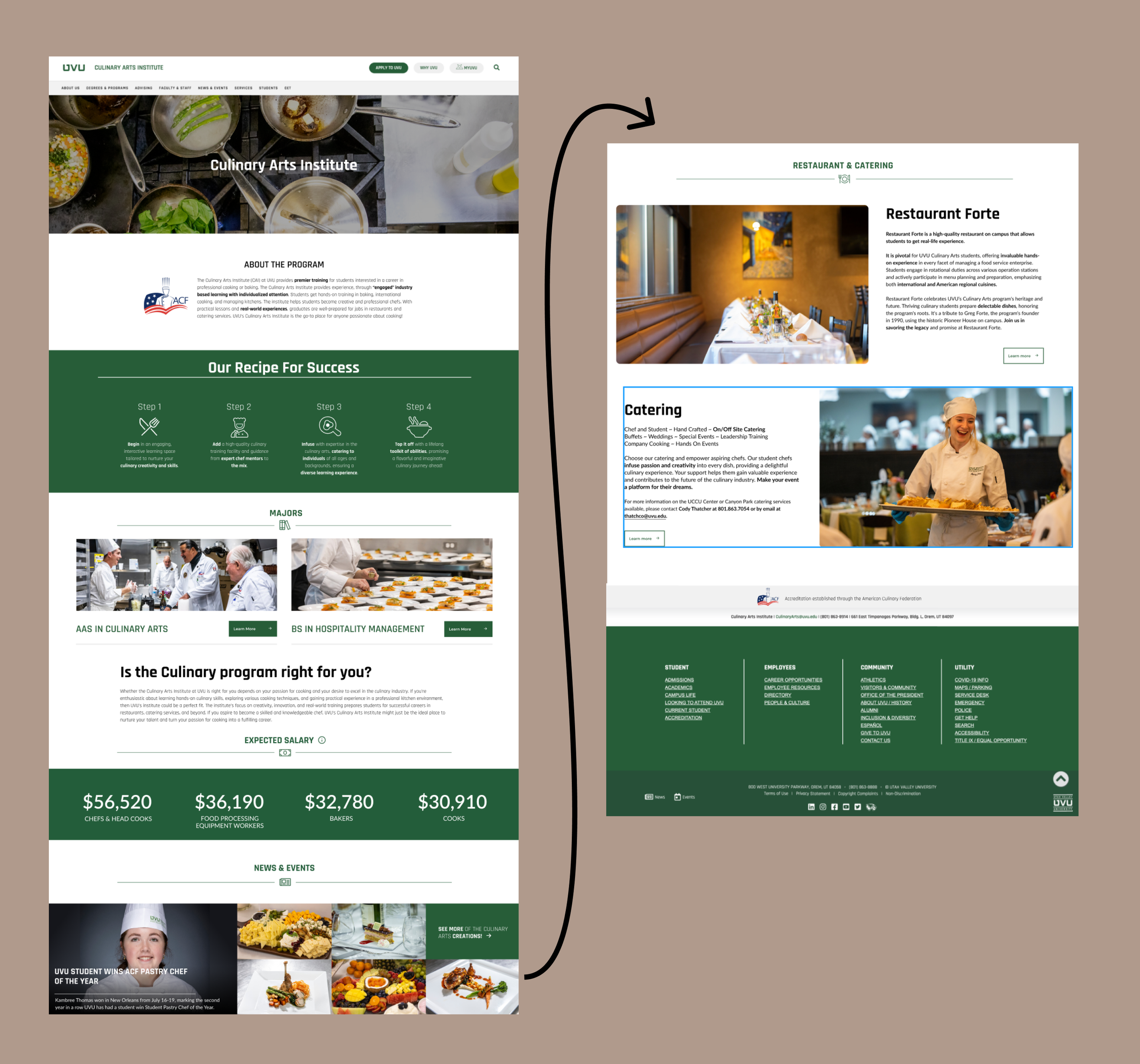
Surface comps— Mobile & Desktop
Our surface comps were what we tested users on in our usability study. We focused on visual hierarchy, defining sections, and choosing strategic photos to make the page look both professional and attractive to a prospective student.
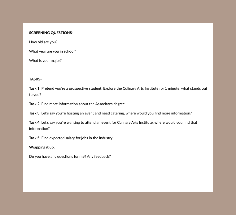
Usability tests
We made a usability test that we conducted on multiple students at UVU. This showed us that we presented all of our information and links in an easy-to-find way.
Mobile Prototype
Our site was designed to be viewed on both the mobile and desktop view. We prototyped each in figma and presented it to our client. Our prototype was then handed off to developers who updated the culinary arts page on uvu that is currently live.
Conclusion
The website is non-mobile-friendly and fails to showcase the program's artistic and hands-on learning. This contributes to students dropping out of the program and fails to engage prospective students.
The website's poor design and lack of focus on the program's strengths cause student dropouts and fail to attract new students.
Shows potential students the hands-on program Culinary Arts Institute offers with descriptions and images
Displays majors information efficiently and potential career salaries
Promotes Restaurant Forte and Catering services


